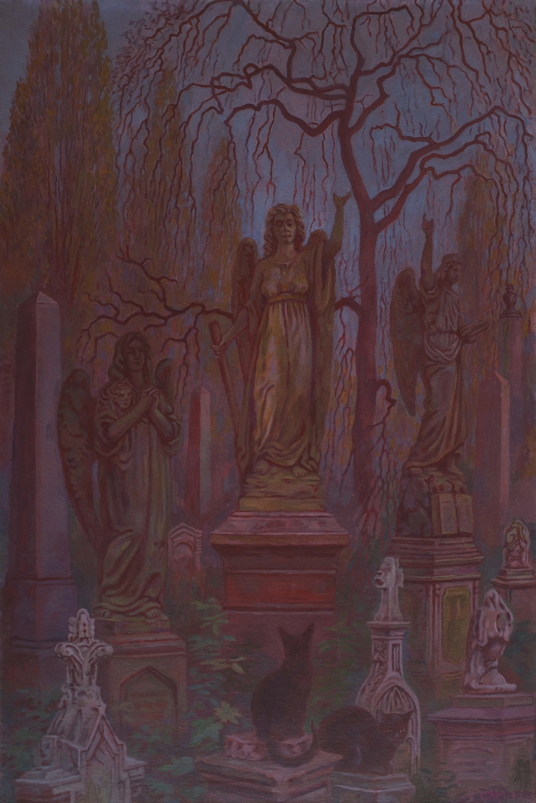
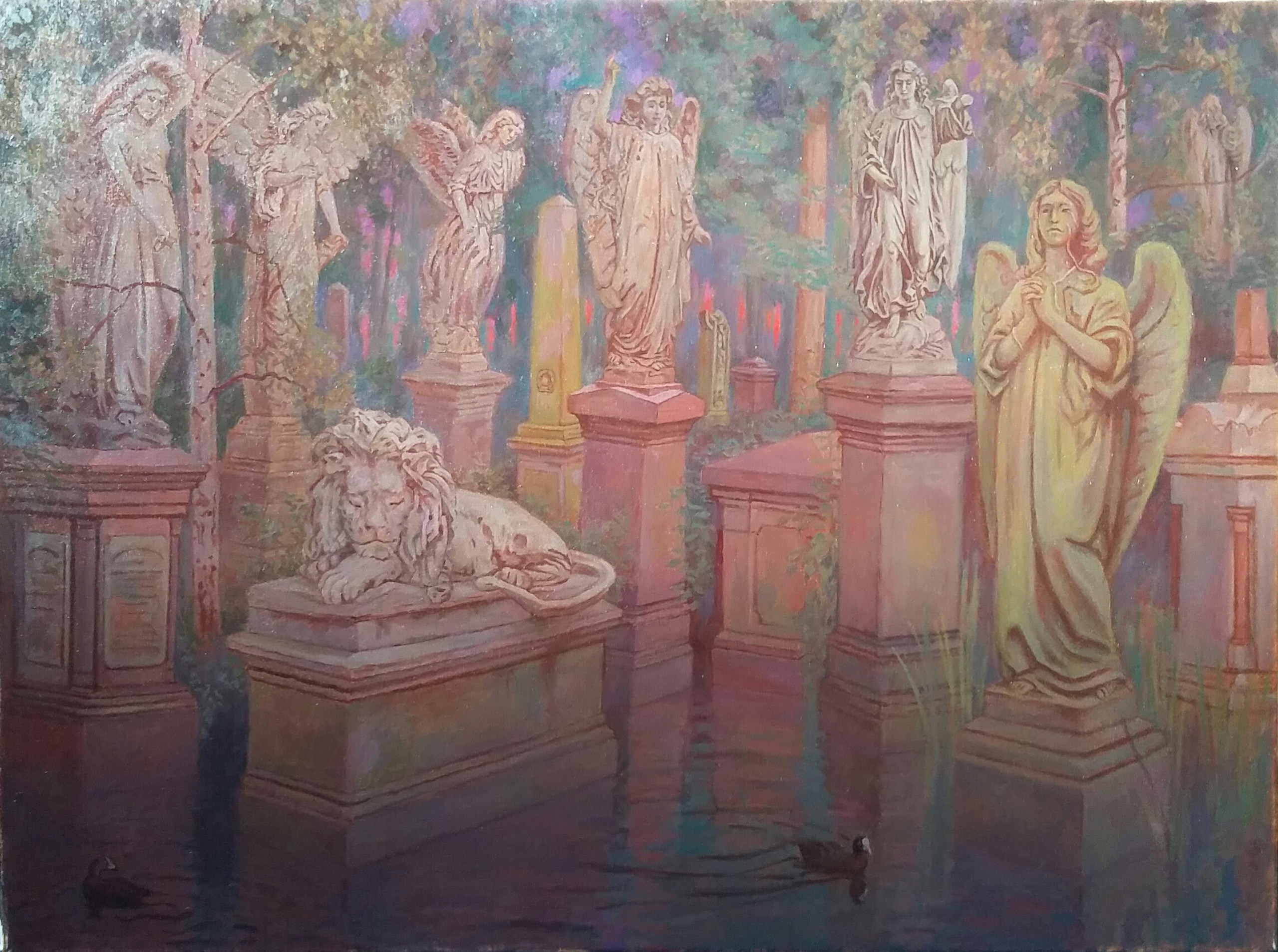
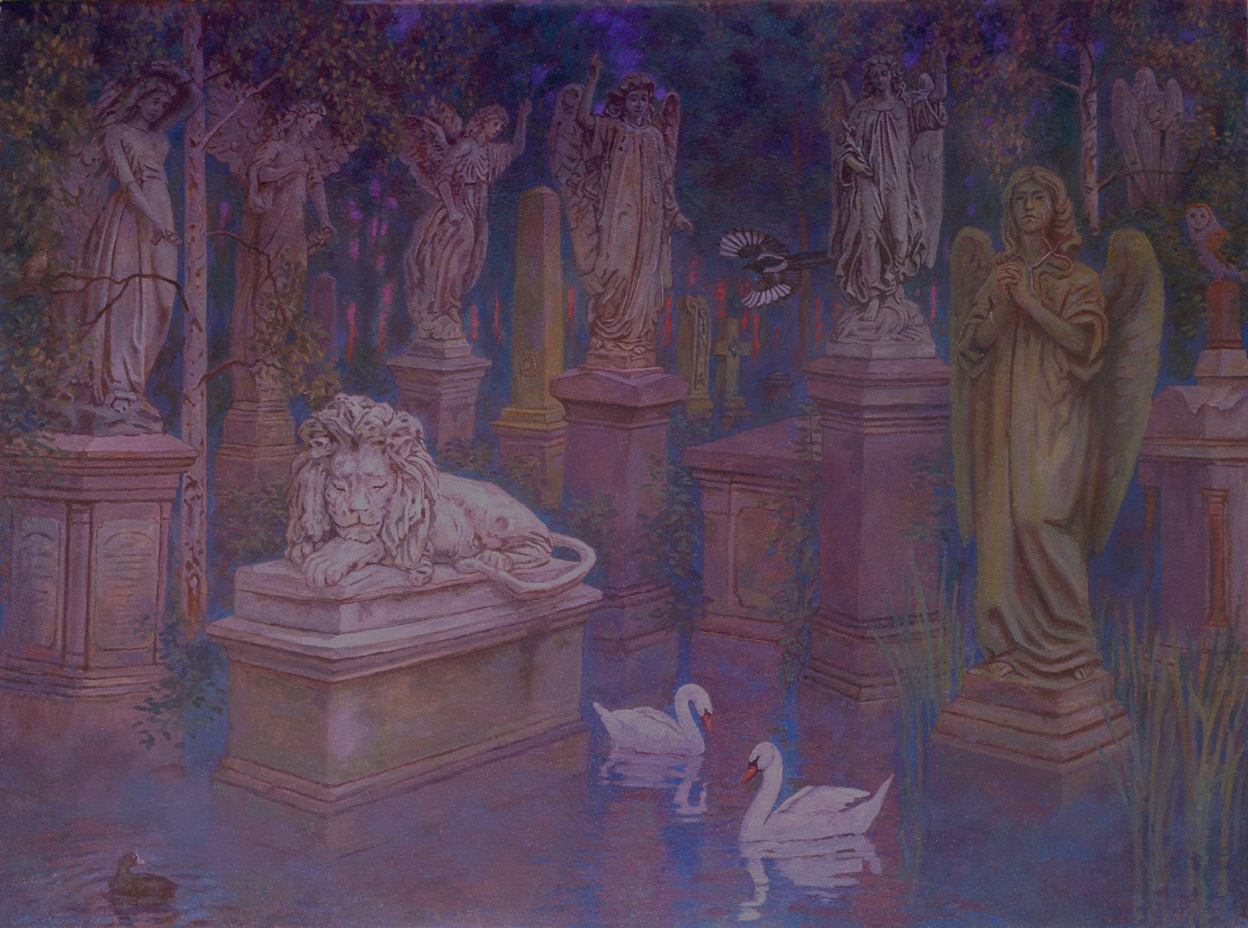
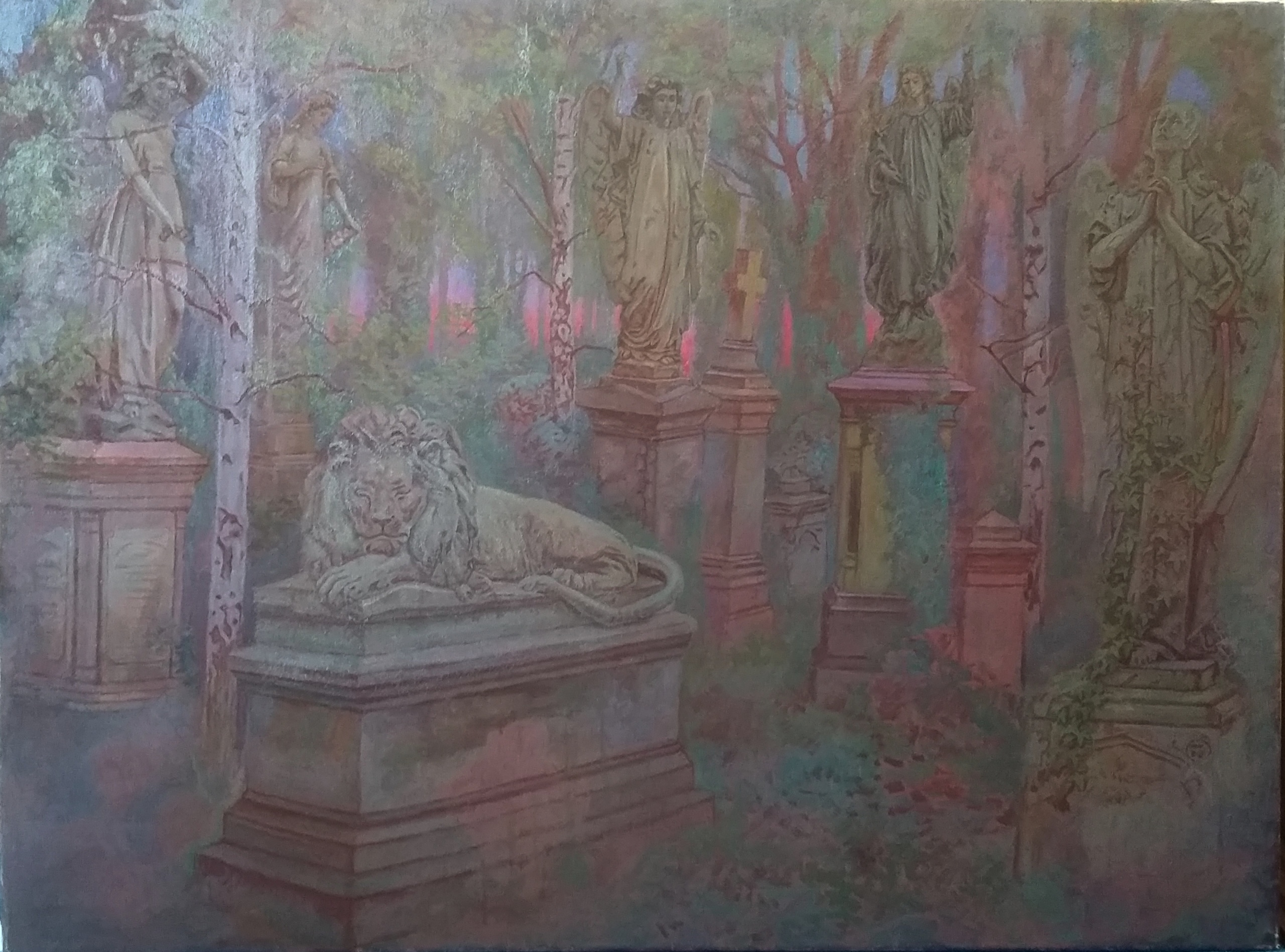
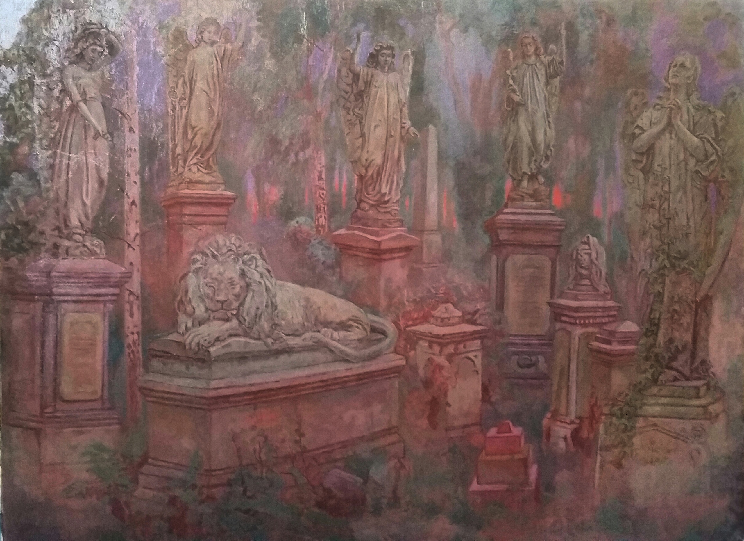
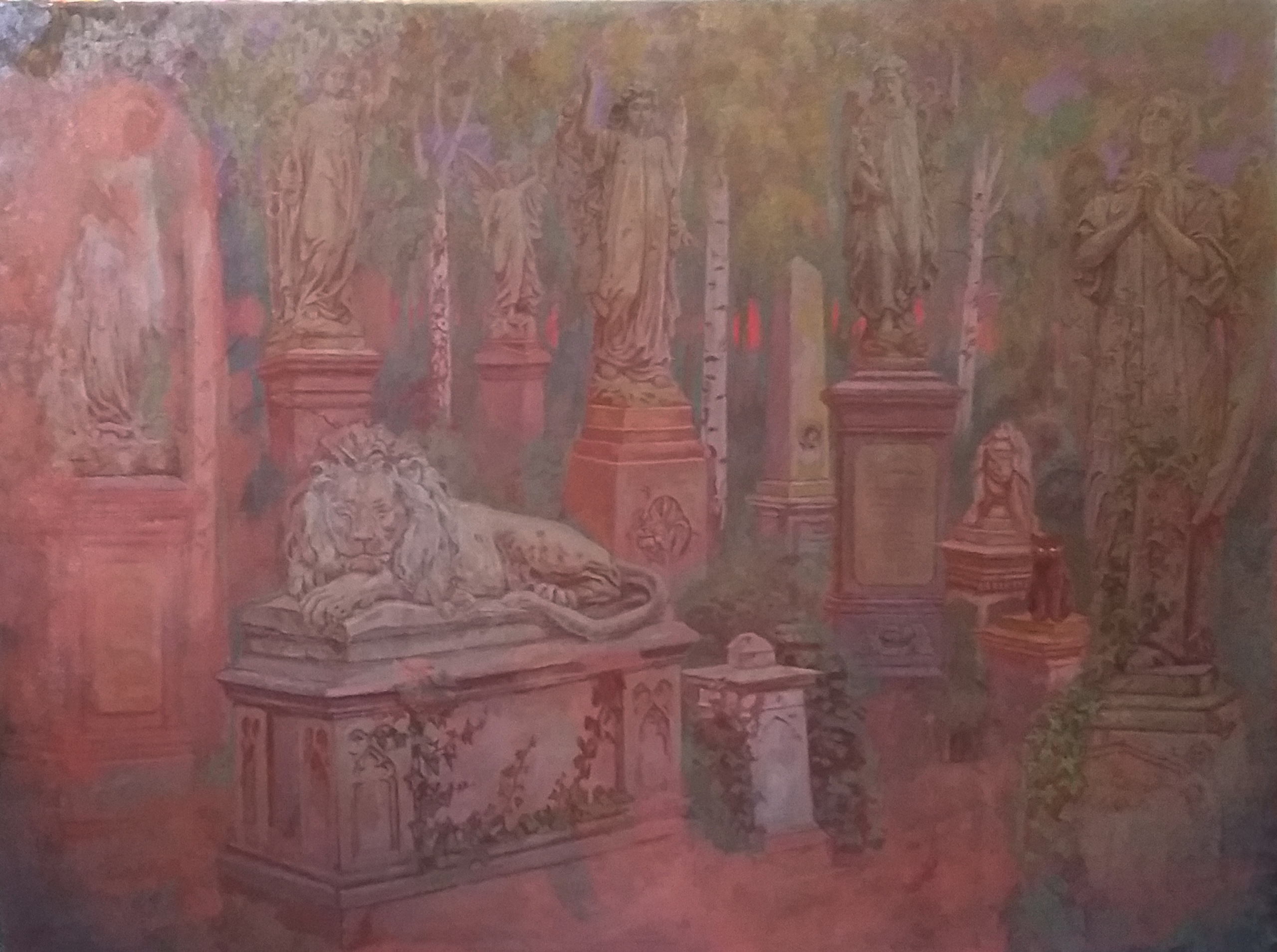
Memento Mori - work in progress
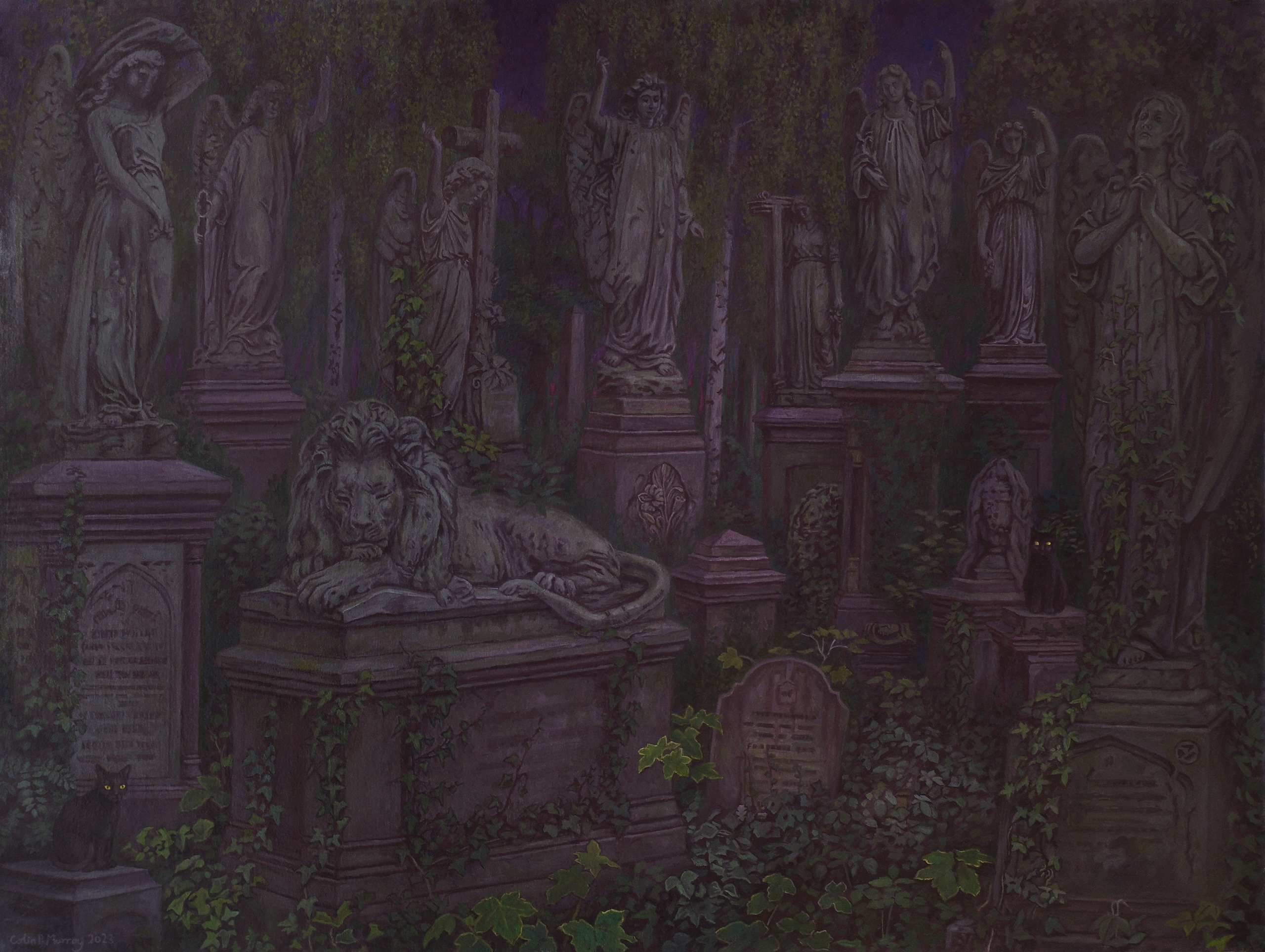
I have always loved Abney Park Cemetery as it's overgrown, atmospheric and it's also home to many birds and species of small animals. My interest in such subjects is discussed in a previous blog entitled 'Abney Park'. I had for a long time wished to make a definitive picture of the statues and graves in this particular cemetery and 'Memento Mori' is the result. Some people may think my interest in such places a bit morbid but that is their prerogative. I find all kinds of ruins interesting as I love the way that nature so quickly takes over because it shows how all the endeavours of mankind are trivial and almost irrelevant as time goes by. In some cultures overgrown graveyards indicate a lack of respect on the part of the deceased persons' descendants who failed to maintain the resting place of their ancestors. Be that as it may, I personally have no interest in the cleaned up graveyards that can be found in some parts of the world.
I began work on this painting back in 2018 and it was finally finished late last year. Whilst working on this picture I also painted 'Rising Mist' and 'Angels'. I have painted a number of pictures inspired by Abney Park and 'Memento Mori' is my favourite. Although it has to be said that these three pictures are quite dark, perhaps they are too dark or maybe the end result reflects some darkness within myself.
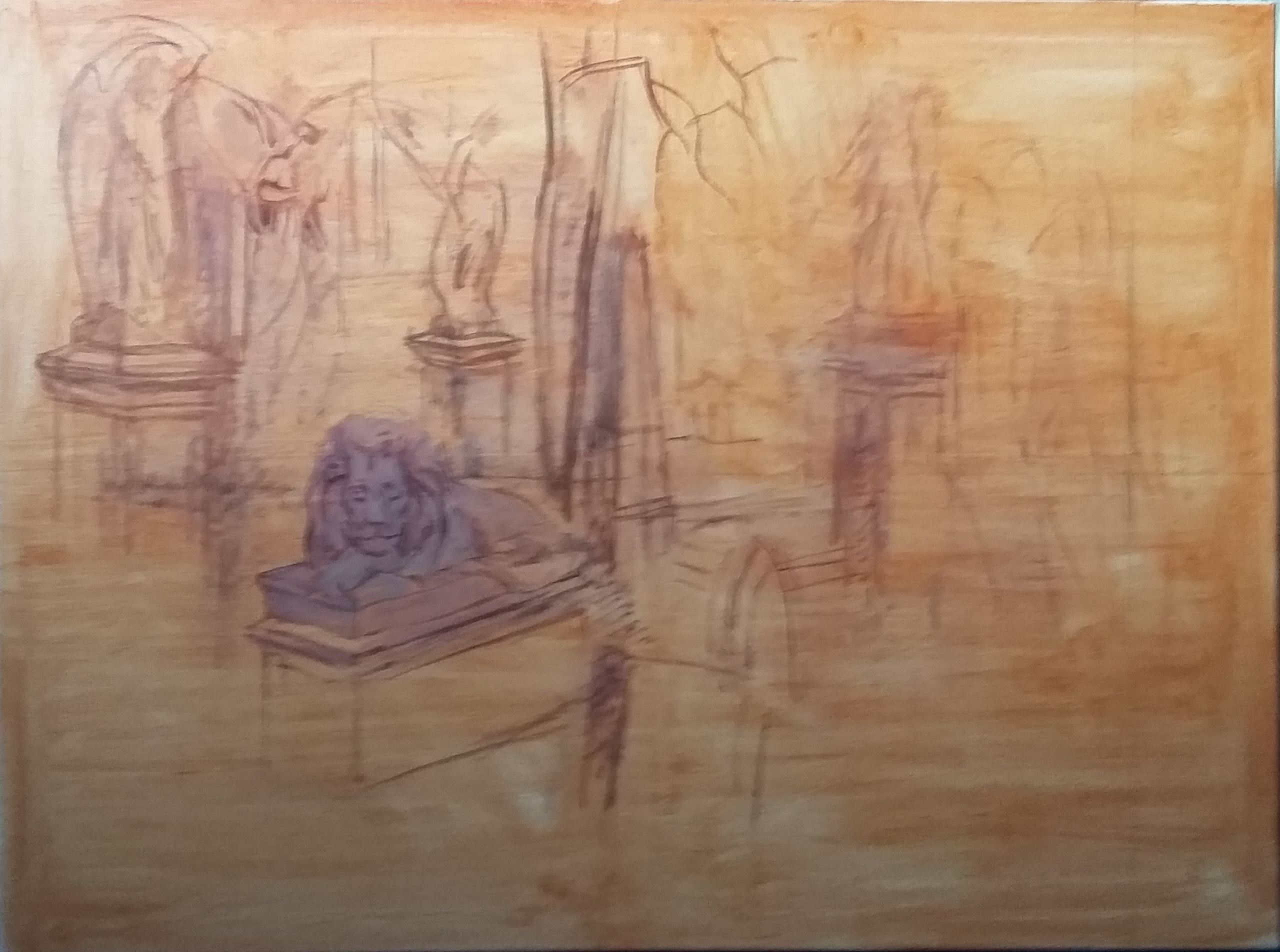
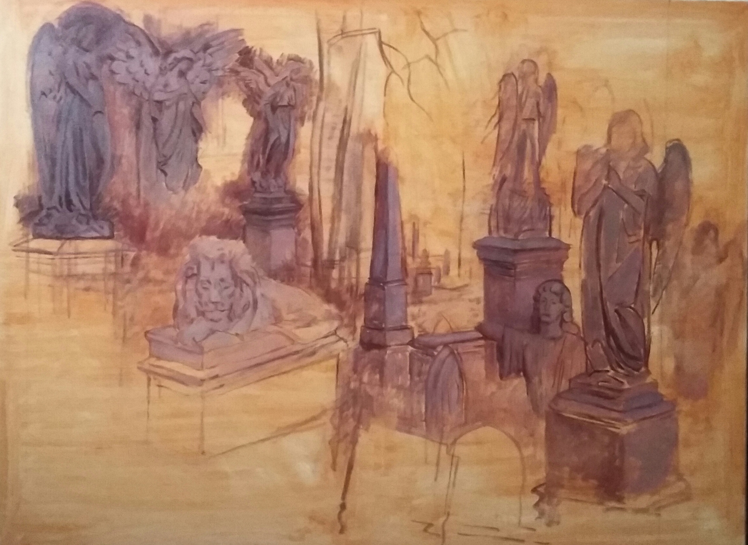
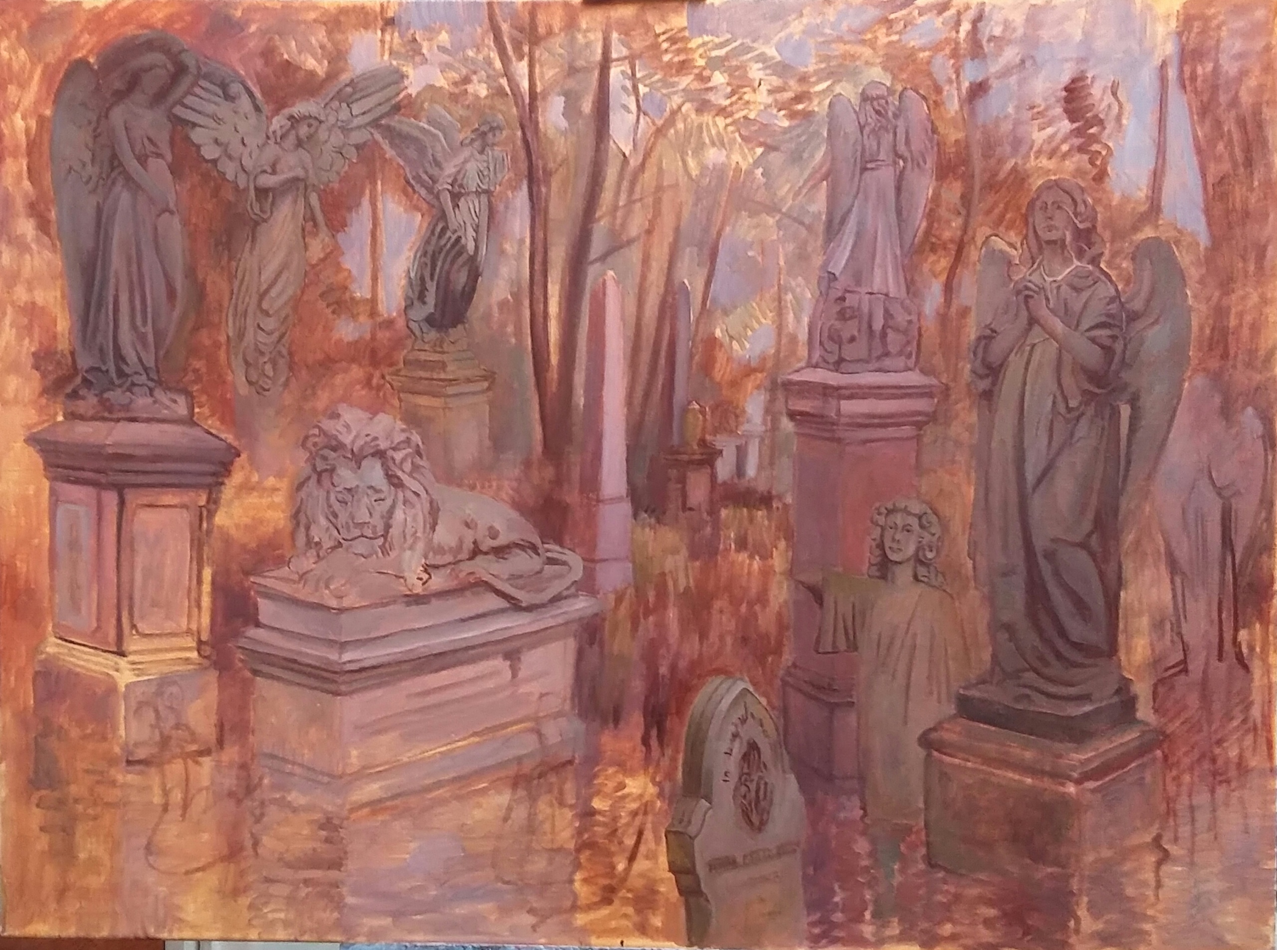
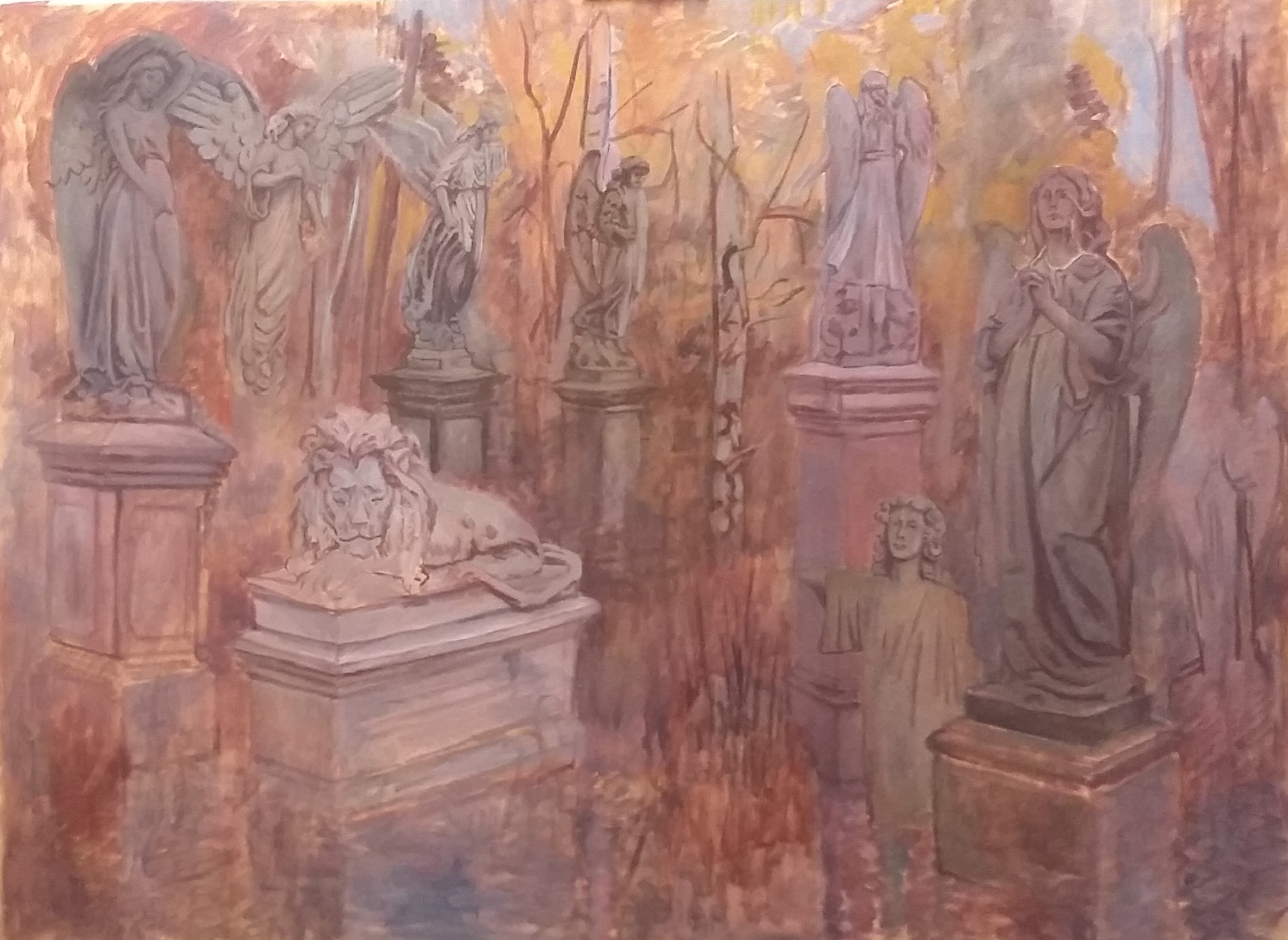
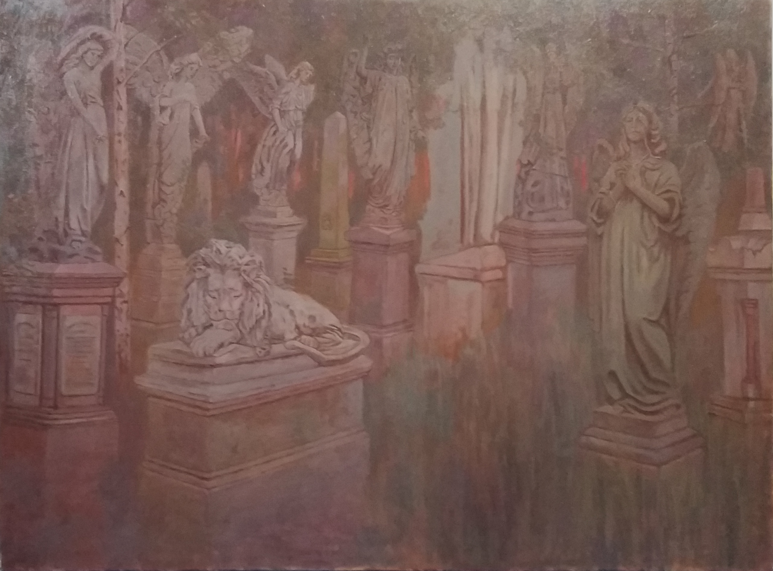
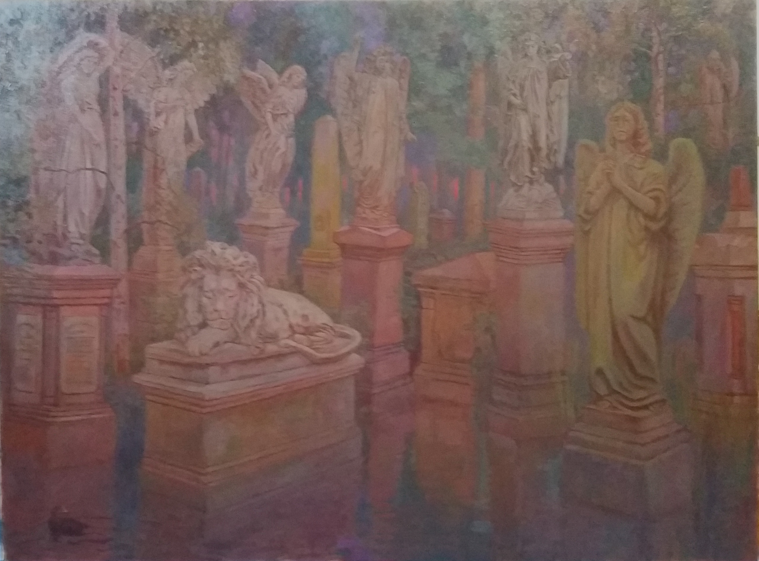
Almost all of the reference material for these paintings came from Abney Park Cemetery with some of the statues being used more than once. Unlike the other two pictures 'Memento Mori' is painted onto a warm ground of burnt sienna. I hardly ever paint onto a white canvas preferring some kind of ground colour, this means that each picture I paint will have its own colour key. I have sifted through hundreds of photographs in order to find the ones that suit my composition. As most statues are on plinths it's difficult to get shots at the right eye level so I sometimes took in a set of step ladders to get the shots I needed.
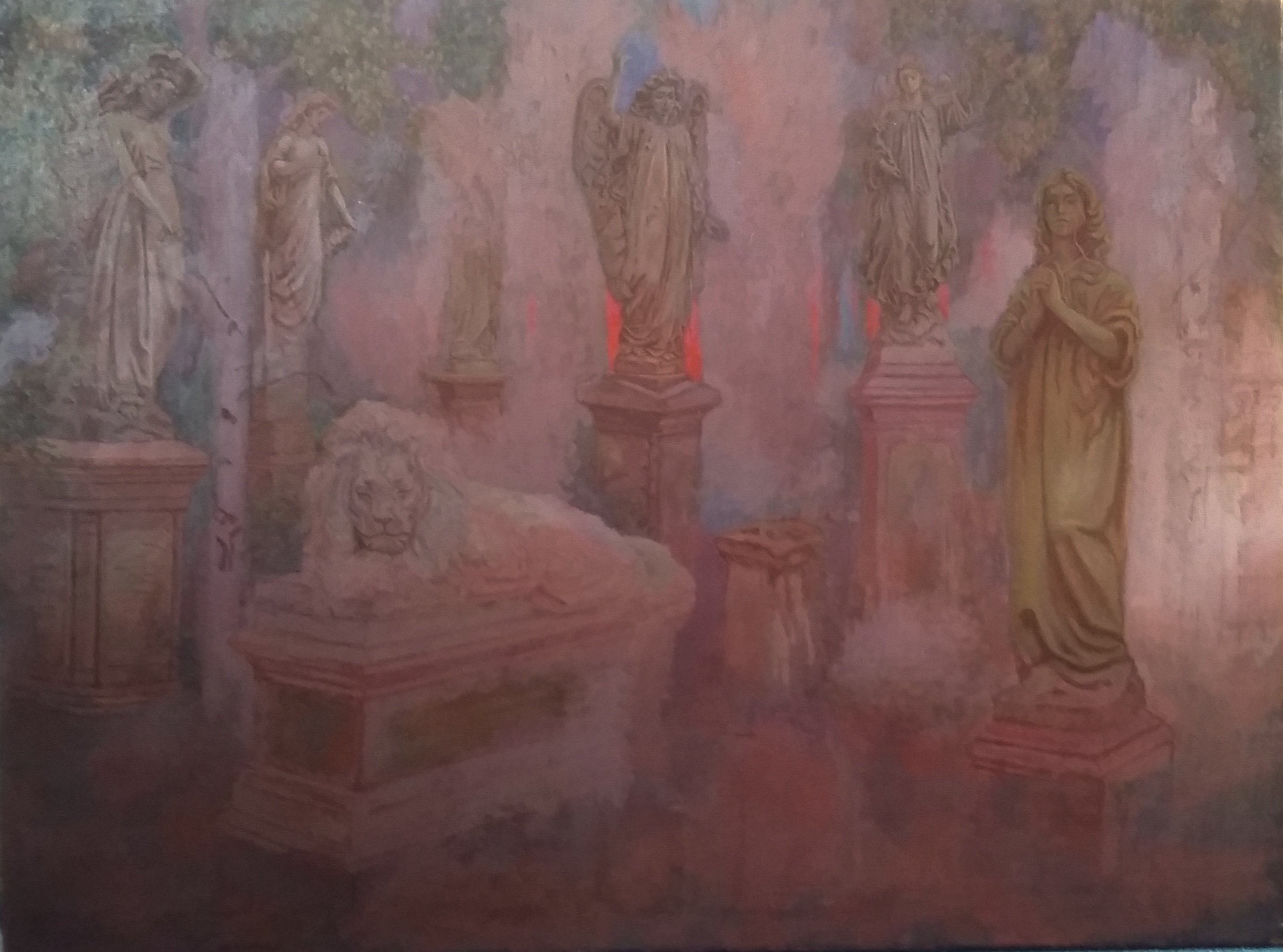
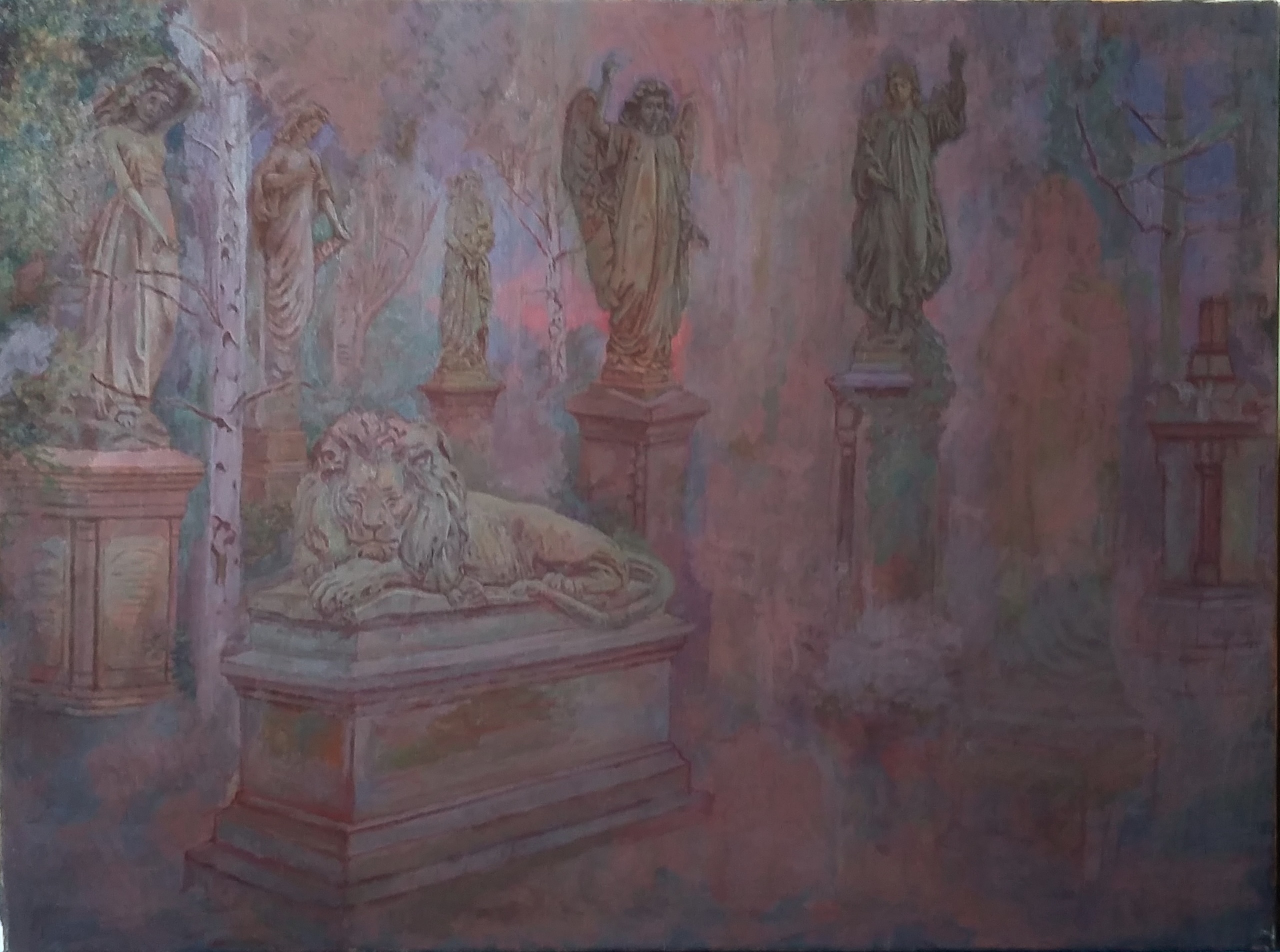
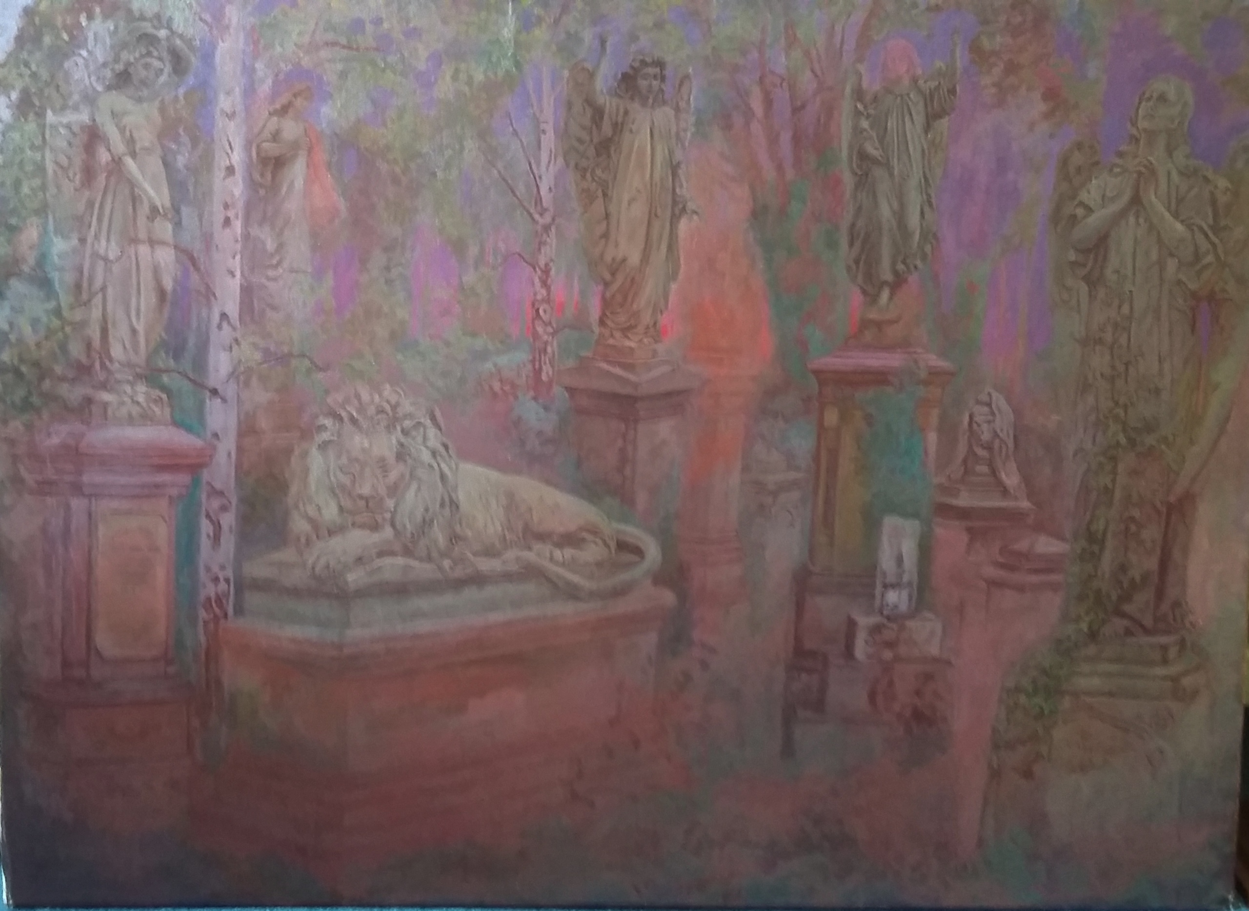
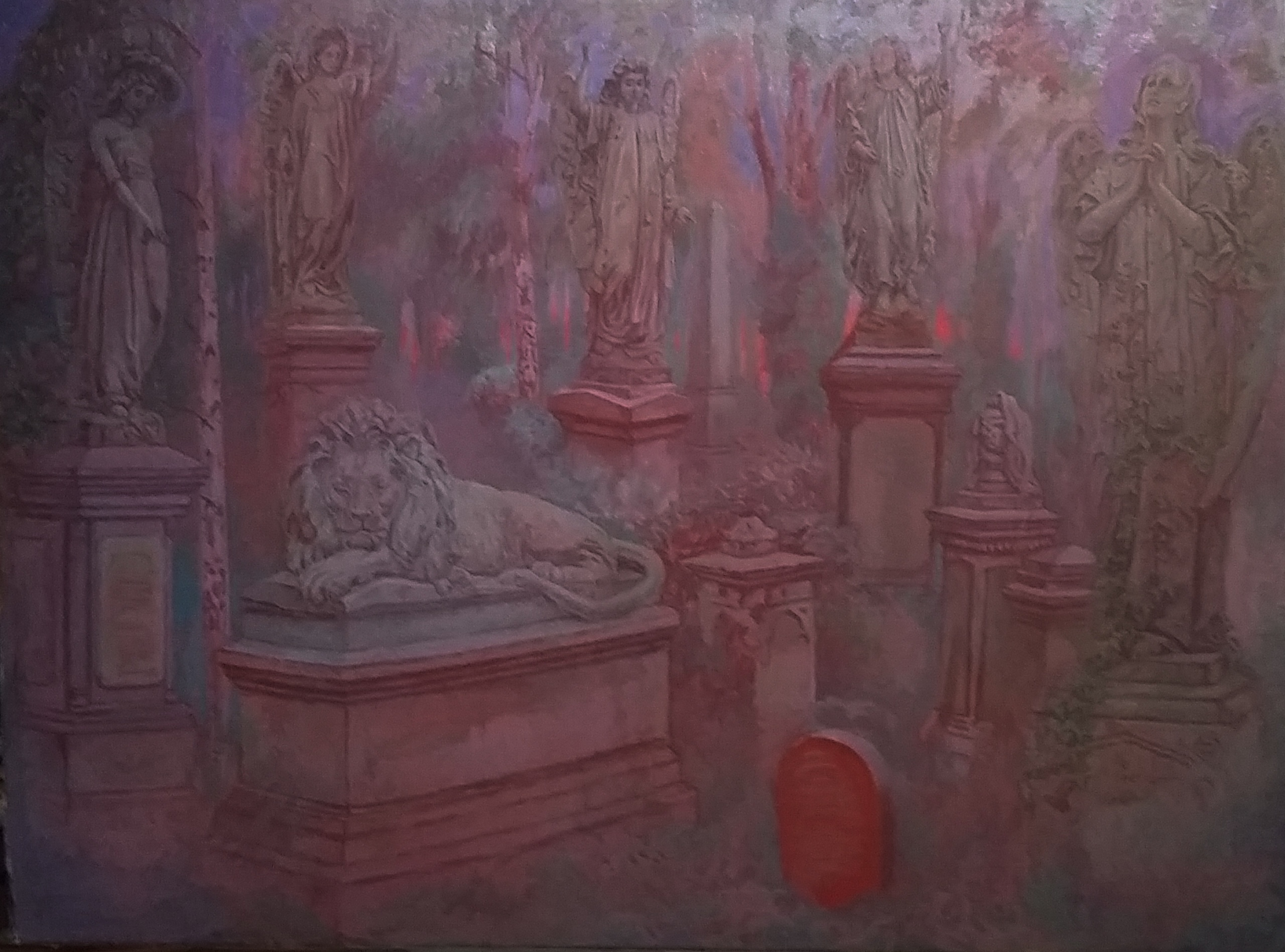
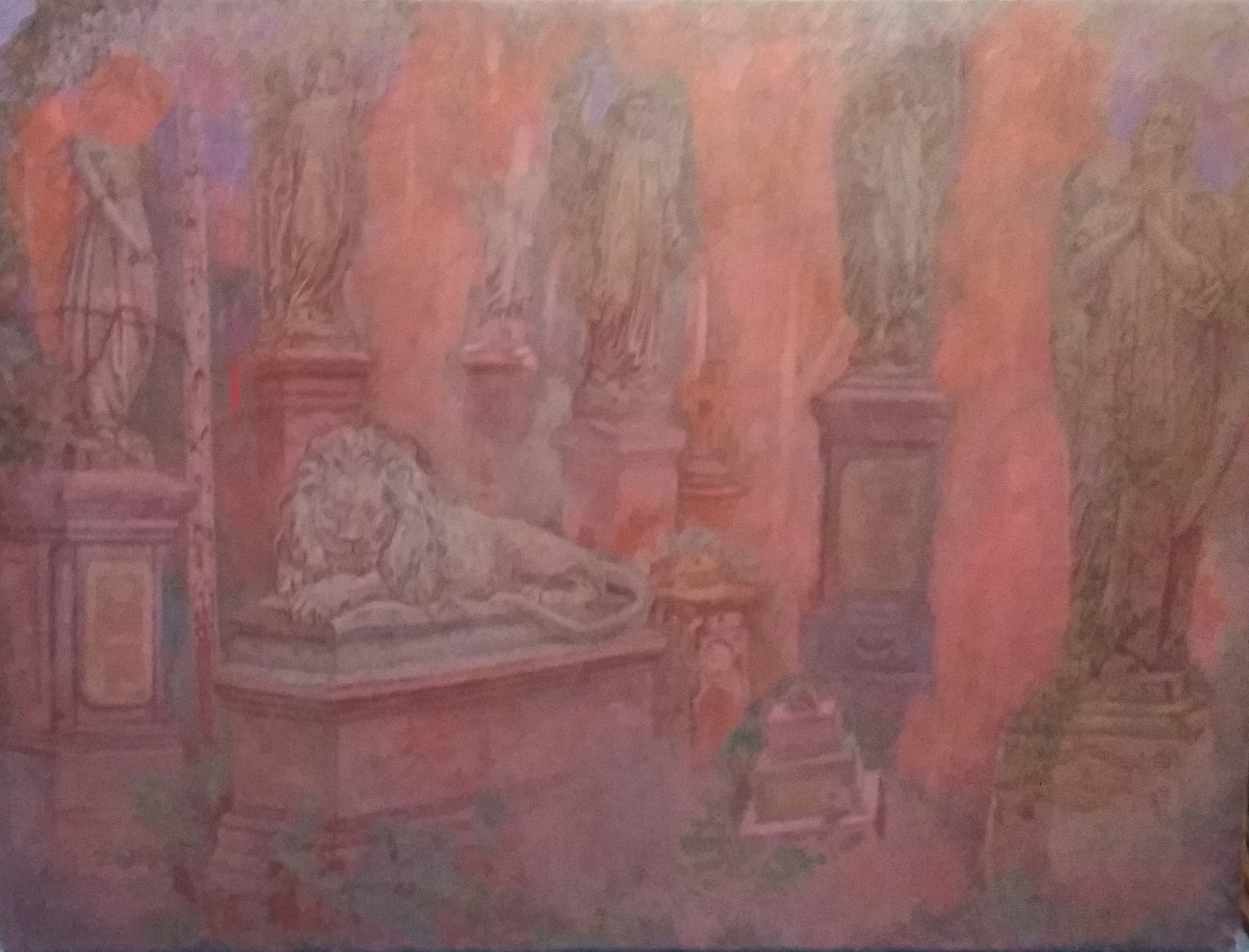
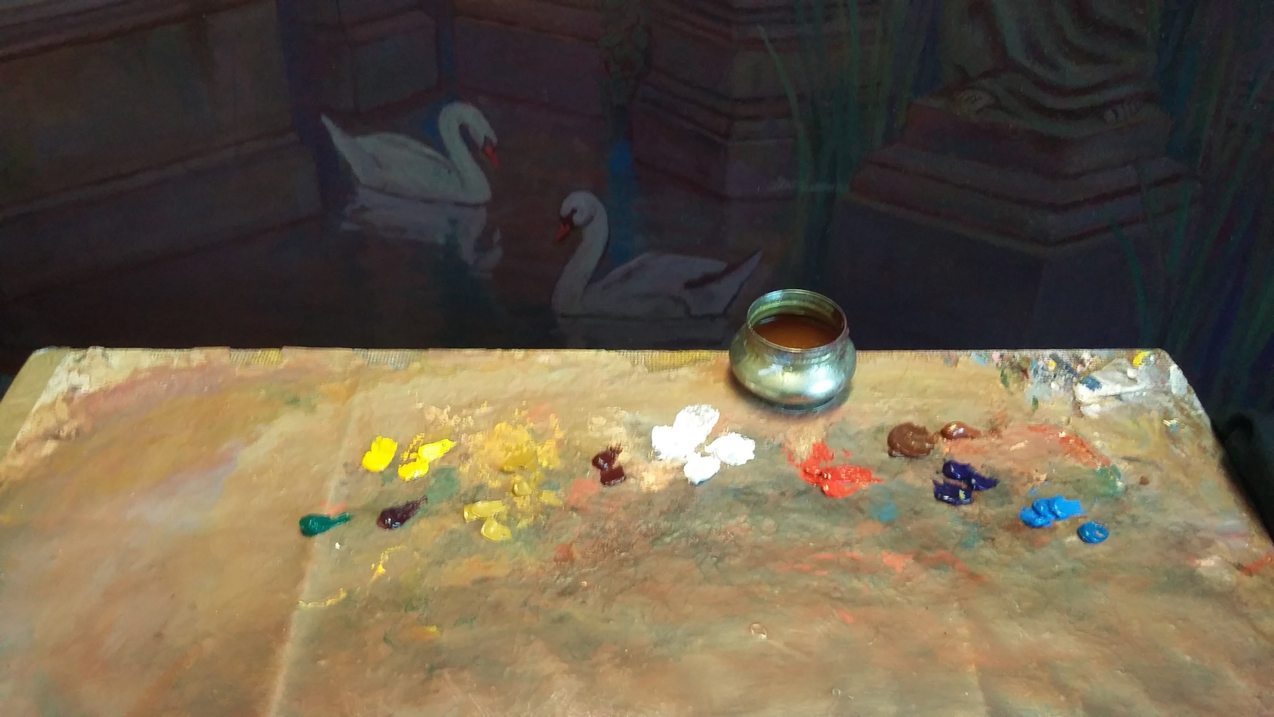
The compositions in these kind of pictures are made up as I go along. I just start drawing with wet paint which can easily be rubbed off if I don't like it. If a part of the composition has dried then I need to return to the ground colour before overpainting as you can see from looking at the sequence of images. Thanks to computers and home printing it's easy to get printouts and images can be printed in reverse if need be. When making pictures of this kind it's important to be aware of eye level and the direction of the light. The first version of 'Memento Mori' featured a flooded foreground with some swans however I was dissatisfied with this so I decided to repaint most of the picture. Firstly I thoroughly sanded the canvas to remove as much paint as possible and then I re-grounded most areas. Now I was ready to re-design the composition, trying different statues and rubbing out or re-grounding as necessary.


This final section is about painting technique and the colours that I use. I mainly paint using Pro Arte Renaissance sable brushes. I thin the paint with a glaze medium that I make myself, this usually consists of equal measures of Refined Linseed Oil, Original Liquin and Pure Turpentine. This medium will stay fresh all day so I can paint 'wet on wet' and it will be dry enough to paint over within a couple of days. The oil paints I use are artists' quality Windsor and Newton and Old Holland. I use a simple palette based on the three primary colours with some earth tints thrown in. Because every picture has a different ground tint the colours will never look the same as they would if I was painting onto white. With oil paint it is best to mix your own colours (unlike acrylic and watercolour) so you do not need numerous tints. Using a simple palette enables one to avoid muddy colour, for example I make black using ultramarine and burnt sienna or cadmium red, this is much better than using ivory black or lamp black etc. I use cerulean blue and ultramarine rather that cobalt blue or Prussian blue, cadmium yellow instead of chrome and so on but this is my personal choice, the principle is stick to the primaries.
I have tried many colours over the years and these are the tints that I prefer from right to left in the image below - two shades of cerulean blue, dark and medium - ultramarine blue - two shades of burnt sienna - cadmium red - titanium white - alizarin crimson - two shades of raw sienna - two shades of cadmium yellow and finally magenta and viridian. These last two colours I rarely use as they are both extreme colours that cannot be mixed and most of the time I don't need them. The tints provided by different paint manufactures often vary for example burnt sienna made by Old Holland is much lighter than the same tint made by Windsor and Newton.
I've provided this information because I have taught painting and aspiring artists want to know about such things. The methods I have described are a good starting point, however there are no hard and fast rules when it comes to painting, you may learn something from one artist and something else from another and through experimenting you will find a technique that suits you.